Live Preview in the editor makes it easy and intuitive to make changes to the content. There may be some differences from the ‘published’ view, depending on how your theme and other plugins are configured, but in essence you can edit tab labels and content directly in the Live Preview area.
To add tabs or accordion items, select the “Tabs or Accordion” block (this is easiest in List View) and then click the Add Tab or Add Accordion Item button. Alternatively, simply duplicate one of the child “Tab” blocks. (Open block options menu, which has the triple-dot-icon, and click “Duplicate”).
To remove a tab, just remove the tab block. (Open block options menu, which has the triple-dot-icon, and click “Remove Tab”, or select the tab in List View and hit Delete).
- Tab / accordion item labels
To change a tab label, select the Tab block (either in List View, or by clicking the tab label you want to edit). In the Block options panel on the right, edit the Label field and you’ll see the label update in the Live Preview. - Tab content
You can add content simply by adding paragraphs or blocks as children of each Tab block.
To change the Layout of your tabs/accordion just use the dropdown in the Block options of the “Tabs or Accordion” block when editing with Gutenberg.
View demos of horizontal, vertical, and accordion layouts
Horizontal layout
- Horizontal Tabs: Responsive Behavior
By selecting from this dropdown list, you can control the responsive behavior when the tabs won’t fit in one line based on the width of the container.- Collapse to Accordion (default)
Select this to automatically collapse to an accordion. - Wrap
Select this to just wrap the tab buttons - none
Select this to have the plugin not try to detect whether or not there is enough room for the tabs in a single line. Depending on your theme, this may result in a horizontal scrollbar unless you add some custom CSS to handle these situations.
- Collapse to Accordion (default)
Vertical layout
You can specify the width of the columns via the following options:
- Vertical Tab List Width
Controls the width of the column containing the tab buttons. Value should be CSS units (e.g. 25%) - Vertical Tab Content Width
Controls the width of the column containing the tab buttons.
Value should be CSS units (e.g. 75%)
Accordion layout
The accordion works well for any screen size already.
- Initially Active Tab (Pro Only) For Vertical and Horizontal tab layouts, you will see this option in the “Tabs or Accordion” block settings. By default, the first tab will be open – select another tab from the dropdown if you wish to override this.
- Open Initially (Pro Only – Accordion layout only) For Accordion layouts, the “Open Initially” checkbox can be found in block options for the “Tab” block. This option can be used to show one or more accordion items upon page load. By default all accordion items are collapsed.
By default the Auto Close Accordion Items dropdown, found in the block options of the “Tabs or Accordion” block, is set to true, meaning that when you click an accordion item’s header button, any other accordion items in the containing accordion will close/collapse. Select false from the dropdown if you want the end user to be able to view/expand multiple items at a time.
For better control of accessibility, this feature allows you to choose the screen reader heading level for the text inside the accordion toggle buttons (which has role=”heading” and aria-level=”3″ by default).
"Tabs or Accordion" block settings

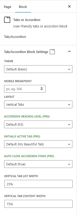
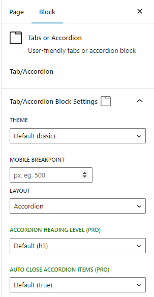
These screenshots are of the settings in the Gutenberg editor for the tabs container block, which has the name “Tabs or Accordion”. These differ per layout, since horizontal tabs have extra options related to responsive behavior, and vertical tabs have options to control the column widths. There are a few other options that will only appear if they are relevant, such as “Responsive Accordions: All Collapsed Initially” (which only appears if a horizontal tabs block has the Responsive Behavior field set to “accordion”).
- THEME
Determines the overall look/feel of the tabs. Choose from Basic, Tabby, or Minimal (a theme that applies only the bare minimum styles to get it to work). Themes can be further customized using CSS – see the demo page for a handy theme customizer! - MOBILE BREAKPOINT
Force the mobile display below this breakpoint (an integer representing screen width in pixels). By default, horizontal tabs will show their mobile display (as determined by “Horizontal Tabs: Responsive Behavior”) when the tabs do not fit in the window on one line. If the Mobile Breakpoint is set, this auto-collapsing behavior will still work, but if you set a breakpoint you can also force this mobile display to occur below this pixel value. - LAYOUT
Determines the kind of control that will be used to display the content. Choose from Horizontal Tabs, Vertical Tabs, or Accordion - HORIZONTAL TABS: RESPONSIVE BEHAVIOR
On smaller screens, for horizontal tabs the default behavior is to collapse to an accordion if the tabs do not fit (or if the screen width is below the MOBILE BREAKPOINT). Using this control, you can choose instead to wrap the tabs or choose none if you do not want to have apply any responsive behavior. - RESPONSIVE ACCORDIONS: ALL COLLAPSED INITIALLY
If HORIZONTAL TABS: RESPONSIVE BEHAVIOR is set to accordion, then if this setting is false (the default), then the first accordion item will be expanded. If it is set to true, all accordion items in this scenario will be collapsed initially. Click here for examples of how to use RESPONSIVE ACCORDIONS: ALL COLLAPSED INITIALLY - INITIALLY ACTIVE TAB (PRO)
Available for horizontal/vertical tabs, this allows you to select the tab that you want shown by default (or select None if you do not want any tab to be shown initially). Please note that if the page loads with a hash matching the tab id, then this tab will load instead (as before). Also, if the layout is set to collapse to accordions on mobile, then the default behavior is to show the accordion item selected here, but this can be overridden with other settings such as RESPONSIVE ACCORDSIONS: ALL COLLAPSED INITIALLY and the Tab block’s Accordion Item: Open Initially field. - AUTO CLOSE ACCORDION ITEMS (PRO)
With this set to false (the default), clicking on an accordion item will collapse all the others so that only the newly selected accordion item within an accordion can be open at a time. Set it to true to not auto-close/collapse, allowing the user to expand multiple accordion items at once. For AUTO CLOSE ACCORDION ITEMS example usage (with horizontal layout set to collapse to accordion) see example #3 here. - VERTICAL TAB LIST WIDTH
For vertical tabs, determines the width of the list of tabs. Enter any valid CSS width value, for example 40rem or 25%. - VERTICAL TAB CONTENT WIDTH
For vertical tabs, determines the width of the content. Enter any valid CSS width value (%, px, etc). - ACCORDION HEADING LEVEL (Pro)
Allows you to select the heading level to use for the accordion items in this container
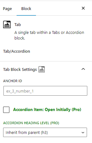
Horizontal/Vertical Tabs: "Tab" block settings
This screenshot is of the individual “Tab” block
- ANCHOR ID
By default, the text of the label will be used to auto-generate a valid id to use for the tab (and the hash link). For example, if the tab’s name is “My Beautiful Tab” then the id will be my_beautiful_tab. If you wish to set your own anchor ids, you can override this using this setting. Important: anchor ids must be unique on a page. - Accordion Item: Open Initially (Pro)
If checked, this accordion item will be forced to be open initially. Works for both layout Accordion and for horizontal tabs with responsive behavior set to collapse to accordion. For the latter, checking this box takes precedence over any parent settings (such as the “Responsive Accordions: All Collapsed Initially”). For Accordion Item: Open Initially example usage (with horizontal layout set to collapse to accordion) click here.
- ACCORDION HEADING LEVEL (Pro)
Allows you to select the heading level to use for this individual accordion item. By default this will inherit from the parent block. Please note: the text for each accordion item is inside a node with role=”heading”, so this heading level affects the aria-level attribute, not the node name or any (built-in) styling.
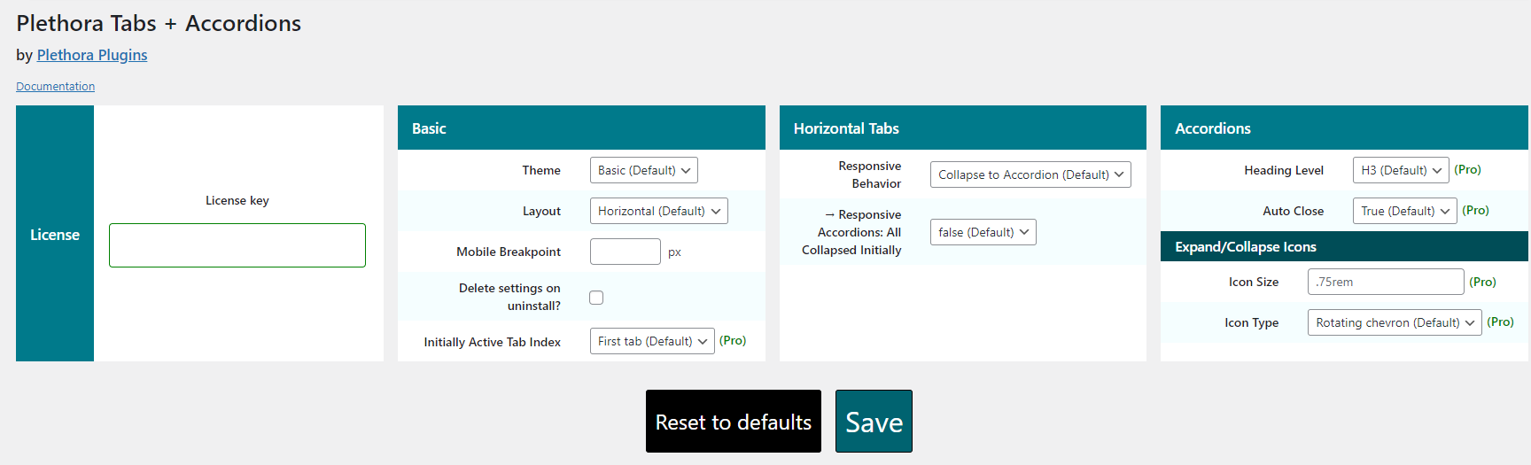
Global Settings Page
The global settings page allows you to specify the defaults for your tabs/accordions. With the exception of the icons, these settings can be modified on a per-instance basis via the block settings (see documentation for the block settings above). It also is where you will enter the license key if you have the PRO version. The following options are only available on the global settings page (for all other fields on this page, please reference the documentation for these same fields above).
License (Pro)
With the pro version, until you enter your current valid license key, all the pro fields will be disabled. To enable these fields, activate your subscription by entering your license in the License key field and click Save.
When a subscription expires, the plugin will continue to render on the front end, but all the Pro fields will no longer be editable.
Accordions Expand/Collapse Icons (Pro)
These fields allow you to configure the icon for the accordion item headings as well as the Icon Size.
Icon Size (Pro)
Enter any valid CSS unit of measurement to control the max width and height of the icon. If left blank, this is set to .75rem.
Icon Type (Pro)
Choose from several types:
- Rotating chevron: (default) This is the default icon, a chevron that rotates when the accordion item expands/collapses
- Custom rotating icon: specify your own icon that will rotate similarly to the default icon.
- Two-state icon: Instead of a rotating icon, you can select two separate icons, one for each state (open/closed).
For options other than the default “Rotating chevron”, there are a few icons you can choose from for convenience, but you can also use any HTML you would like to use as your icon (for example any svg markup).